Midwest Service Center
An industrial services site built to showcase expertise and strengthen credibility.
An industrial services site built to showcase expertise and strengthen credibility.
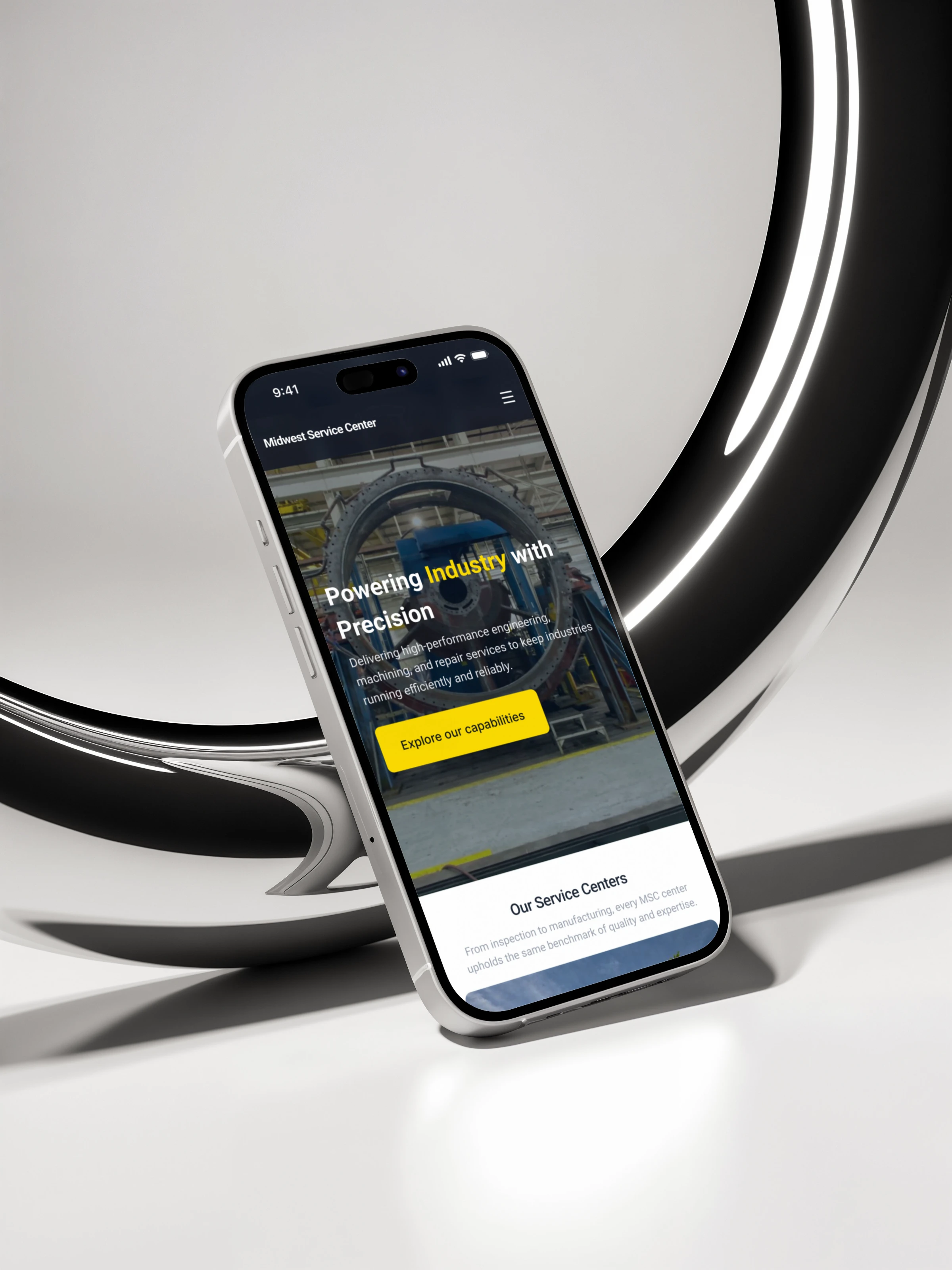
Midwest Service Center had an existing website, but this project was a full redesign rather than an incremental update. The aim was to create a clearer, more credible digital presence for the business through a new visual direction and a more structured service experience.
MSC needed a website that could communicate a broad range of industrial services without overwhelming prospective clients. With a completely new visual and content direction, the challenge was to make the offer feel credible, easy to scan, and grounded in the industrial environment the business serves.
We created a scannable service experience built around clear categories, concise descriptions, and an industrial visual system. The new direction uses strong hierarchy and familiar industrial cues to help prospective clients understand MSC’s expertise at a glance.

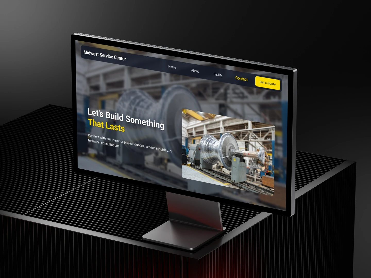
The service catalogue organizes MSC’s capabilities into clear, easy-to-scan service cards. Each card combines an icon, a service name, and a concise description, giving every capability equal visibility within a consistent layout. This helps prospective clients quickly identify the areas most relevant to their needs, understand what MSC offers at a high level, and explore further only when they need more detail.

MSC provides precision, reliable, and dedicated turbine services to ensure strict adherence to demanding specifications.

Electrical Services
MSC provides precision, reliable, and dedicated electrical services to ensure strict adherence to demanding specifications.

Valve Repair
MSC provides precision, reliable, and dedicated valve services to ensure strict adherence to demanding specifications.

Mechanical Services
MSC provides precision, reliable, and dedicated mechanical services to ensure strict adherence to demanding specifications.

Precision Parts Manufacturing
MSC provides precision, reliable, and dedicated field services to ensure strict adherence to demanding specifications.

Pumps and Compressors
MSC provides precision, reliable, and dedicated inspection services to ensure strict adherence to demanding specifications.
Stop Here
These cards continue beyond the screen.
Drag sideways to uncover the
rest.

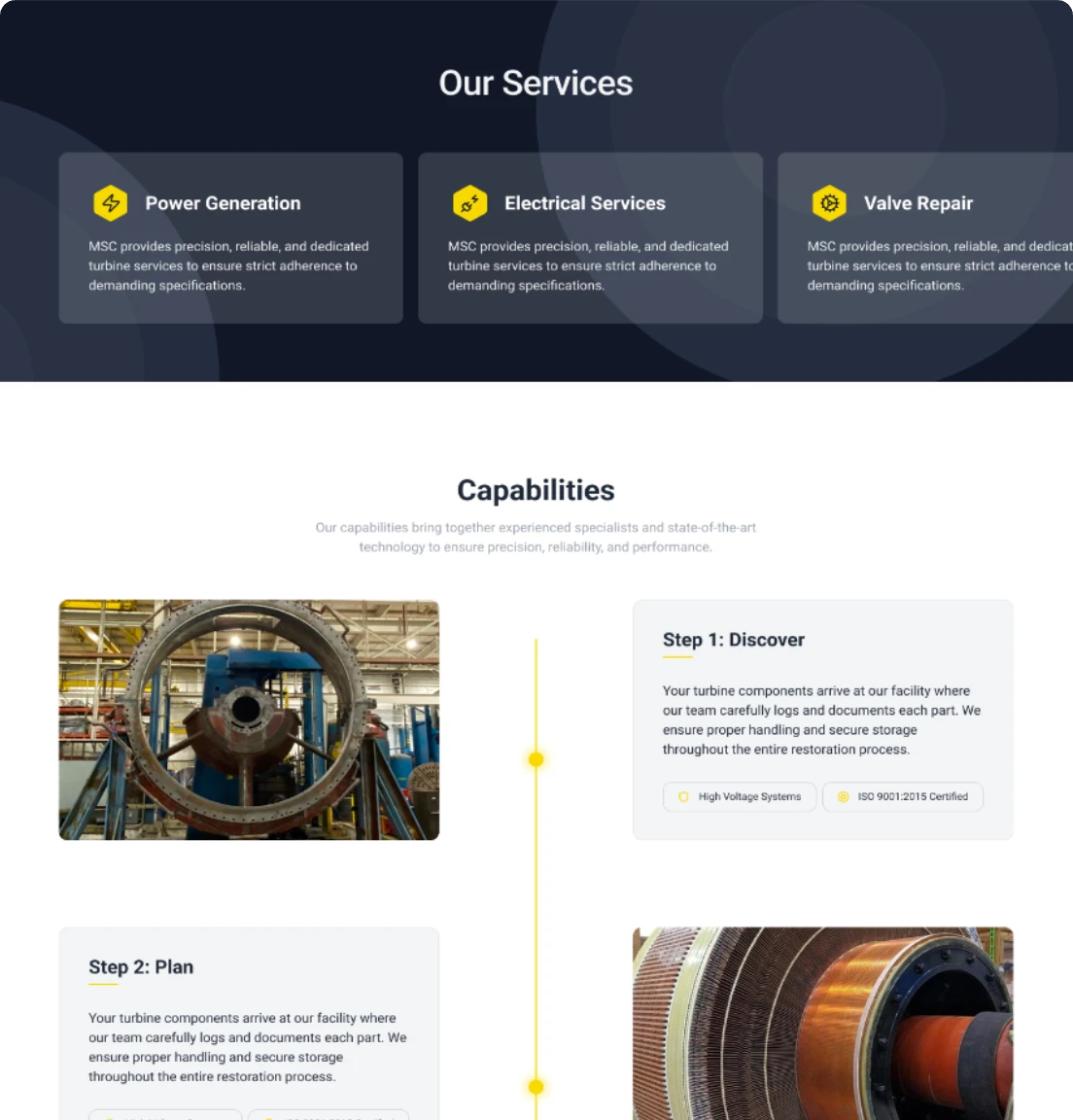
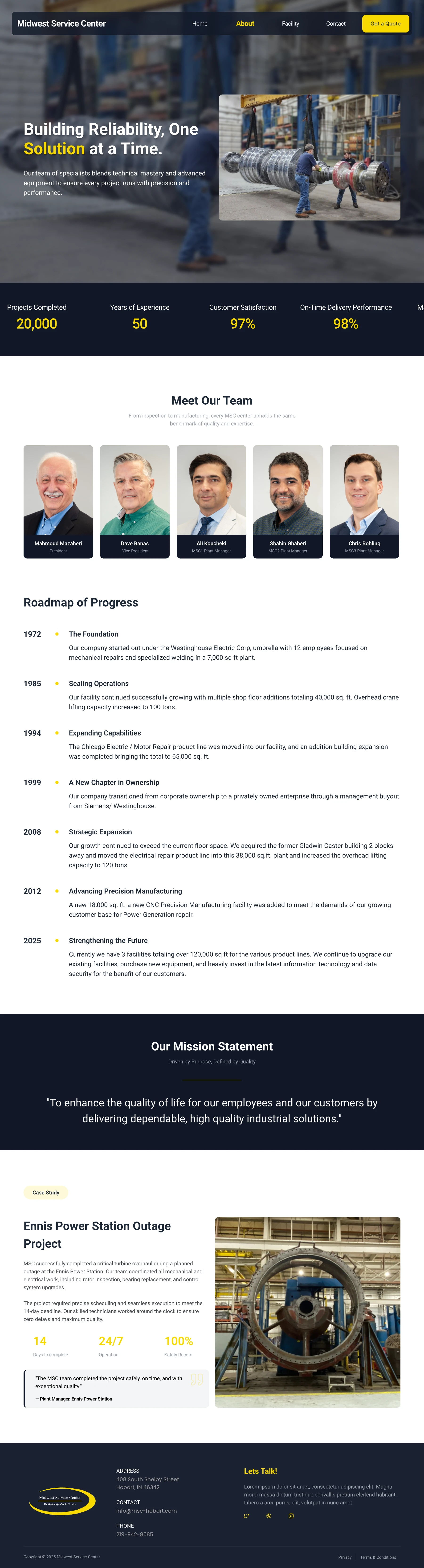
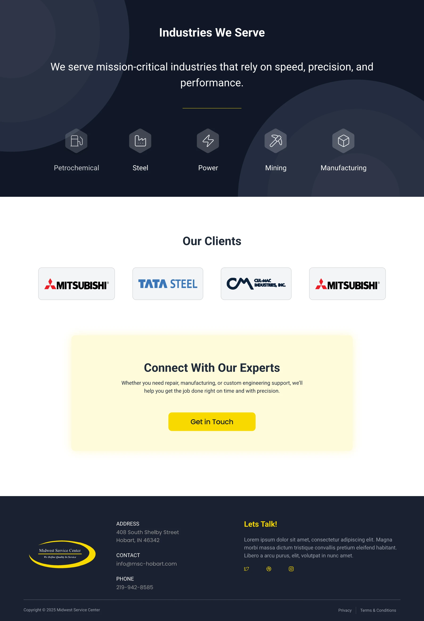
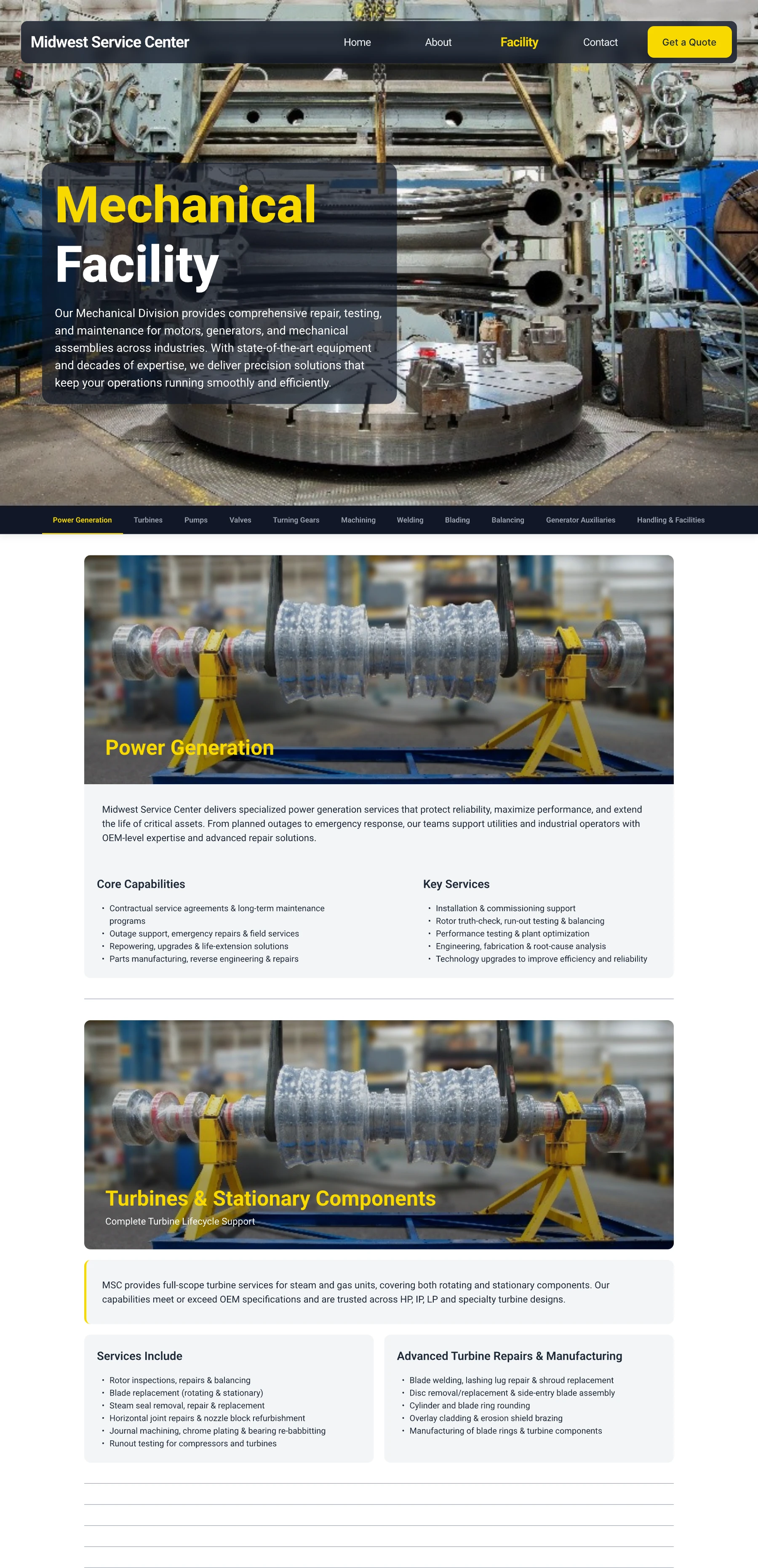
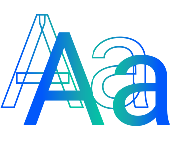
The visual system borrows directly from the shop floor: safety yellow for anything that needs attention, navy for the weight of five decades in the business, and grid-aligned layouts that mirror technical drawings rather than typical corporate web design. Machine gray and factory white round out the palette, keeping the interface calm everywhere the yellow isn't doing the talking. Typography stays bold and direct no delicate serif flourishes, nothing that would look out of place stenciled on equipment. The goal wasn't to look "sleek" in the way a typical SaaS product does it was to look like it belongs in an industrial plant, because that's who's actually going to trust it. Every choice, from spacing to contrast, was guided by one question: would this remain clear and credible on a tablet in a facility, not just on a designer’s monitor? That's the bar the whole system was built to clear.
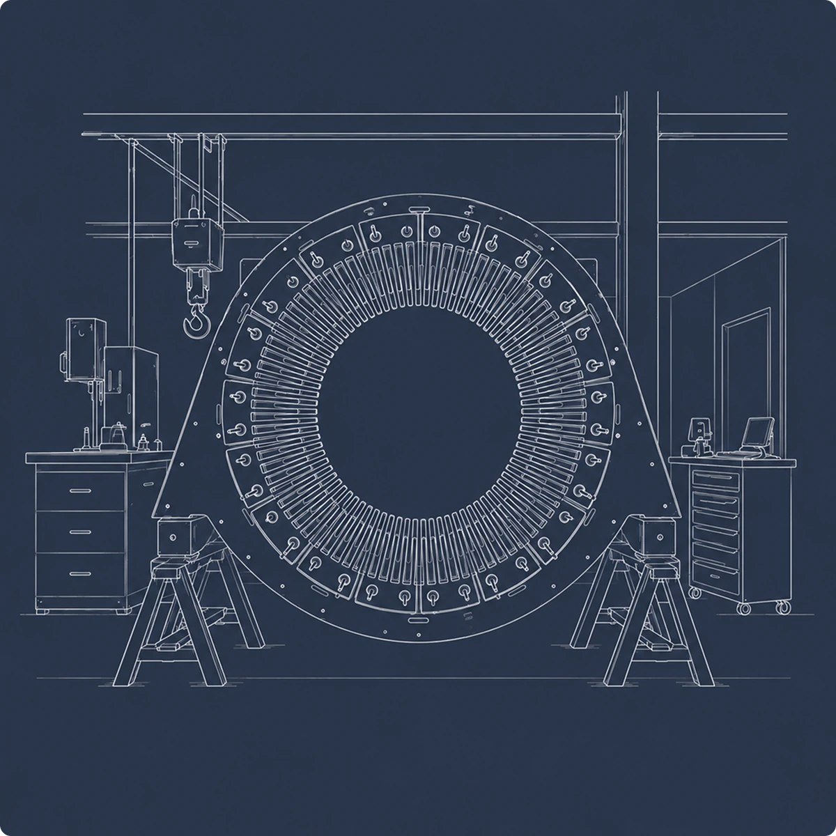
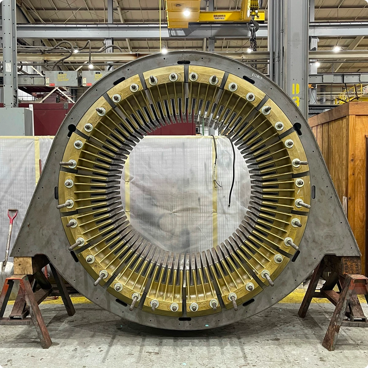
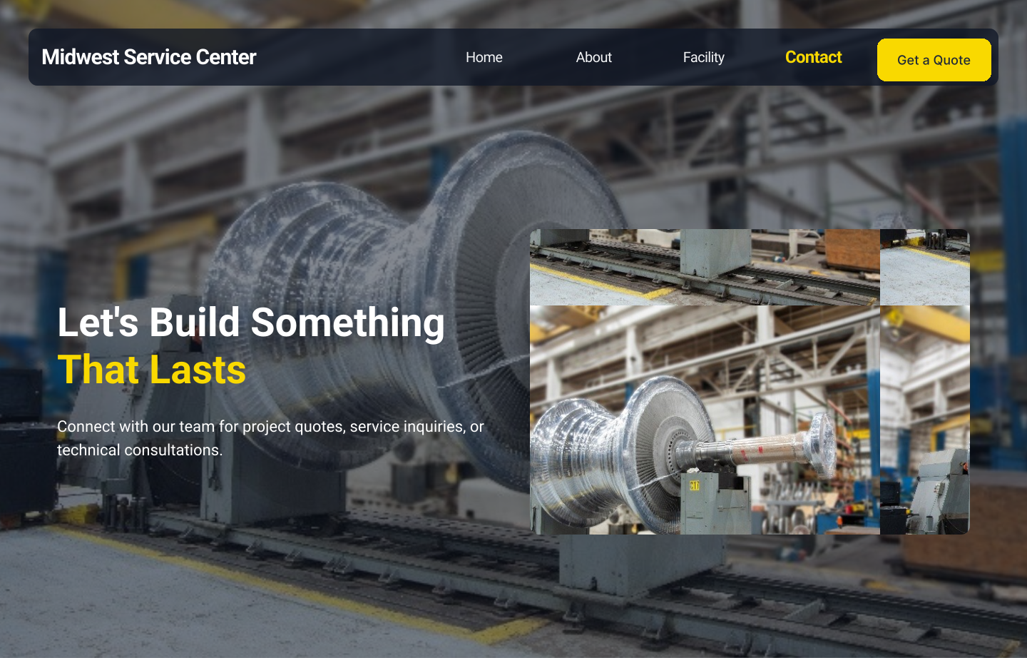
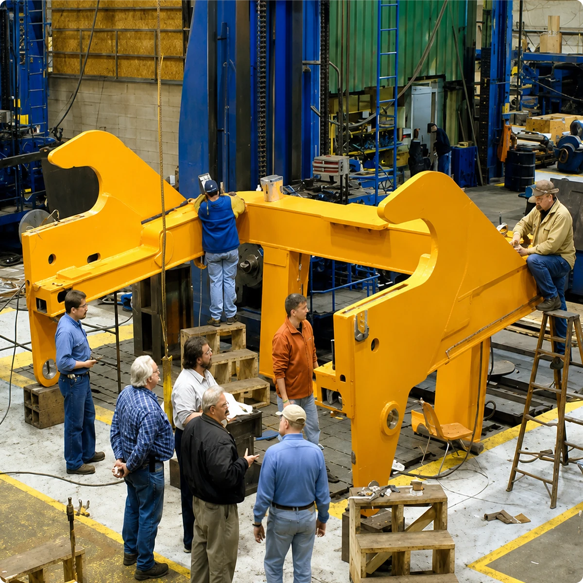
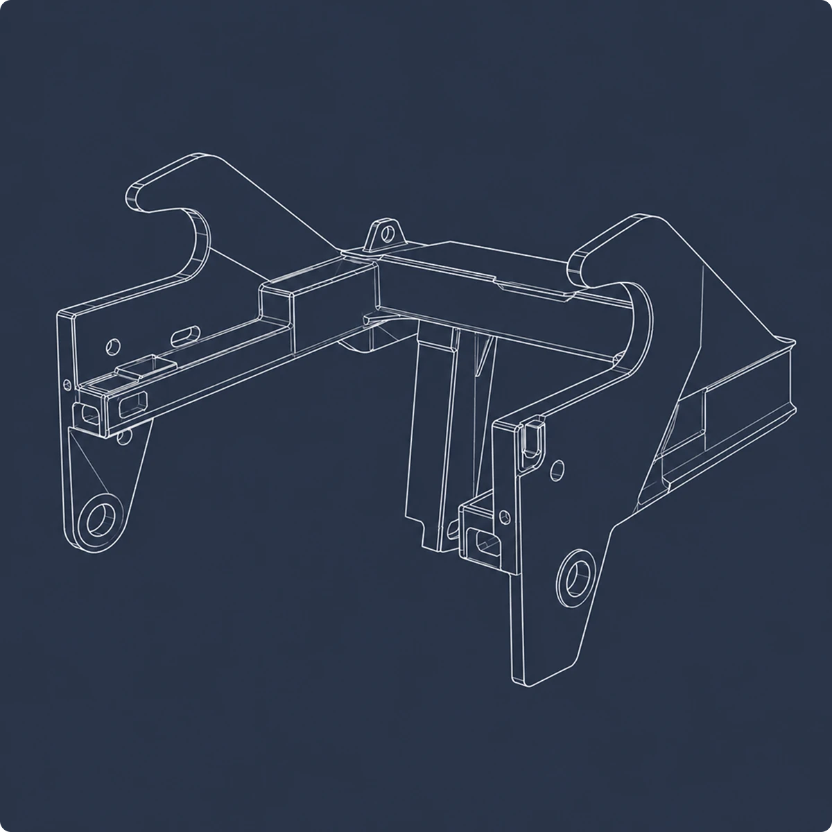
Reviewed MSC’s existing website, comparable industrial-service websites, and industry content to understand how similar capabilities are typically communicated. I used those findings to shape the experience and user flows.
Organizing MSC’s services into a clearer website structure that helps prospective clients understand its capabilities and find relevant information quickly.
Designing the interface and visual hierarchy for key site pages, using service cards, clear sectioning, and strong calls to action to make MSC’s capabilities easy to explore.
Defining a visual direction rooted in industrial references colour, typography, imagery, and layout so the website feels credible and appropriate for MSC’s industry.
Every interaction was designed to provide immediate visual feedback without disrupting the clean, industrial aesthetic.
HOVER TO EXPERIENCE
TAP TO EXPERIENCE
Move your cursor across the navigation to explore the hover states.
Tap “Facility” in the navigation to open its menu.
Industrial clients don't browse, they evaluate. They arrive with a problem and need to know in seconds whether this company can solve it. So every decision came back to the same test: does this earn trust, or does it just fill space?
Safety yellow that signals without shouting. Navy that carries five decades of credibility. Typography sized for someone reading on a tablet in a facility, not a design critic in a studio. Nothing is there because it looks good. Everything is there because it works.