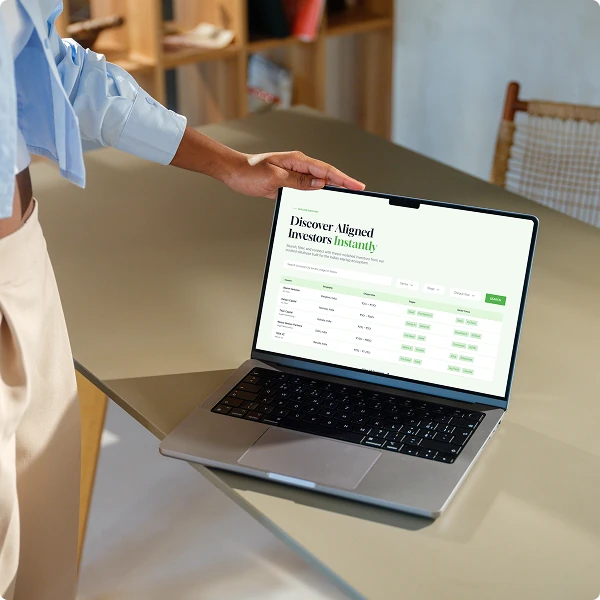
Right From Start
A platform designed to guide every stage of the startup journey.
A platform designed to guide every stage of the startup journey.
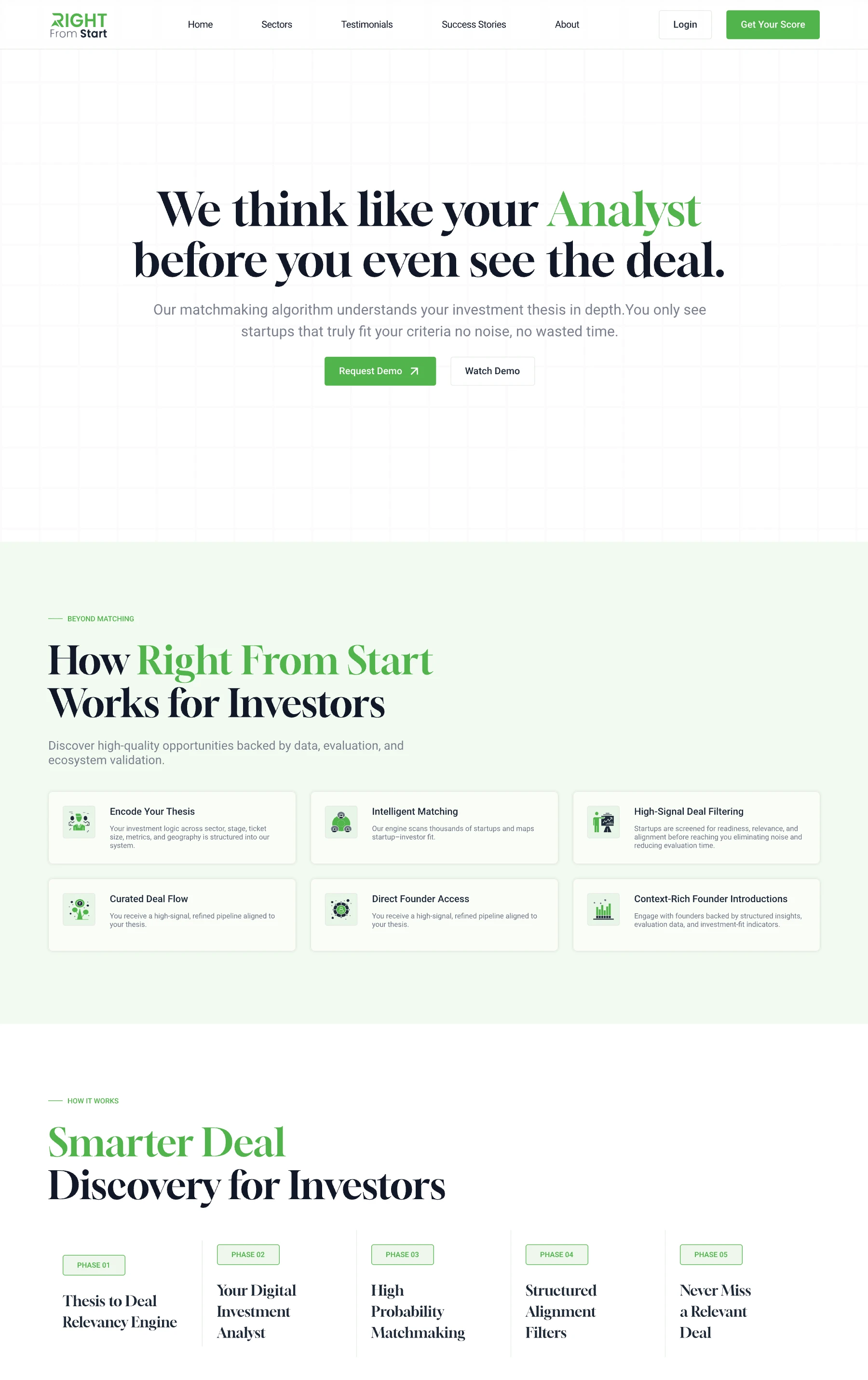
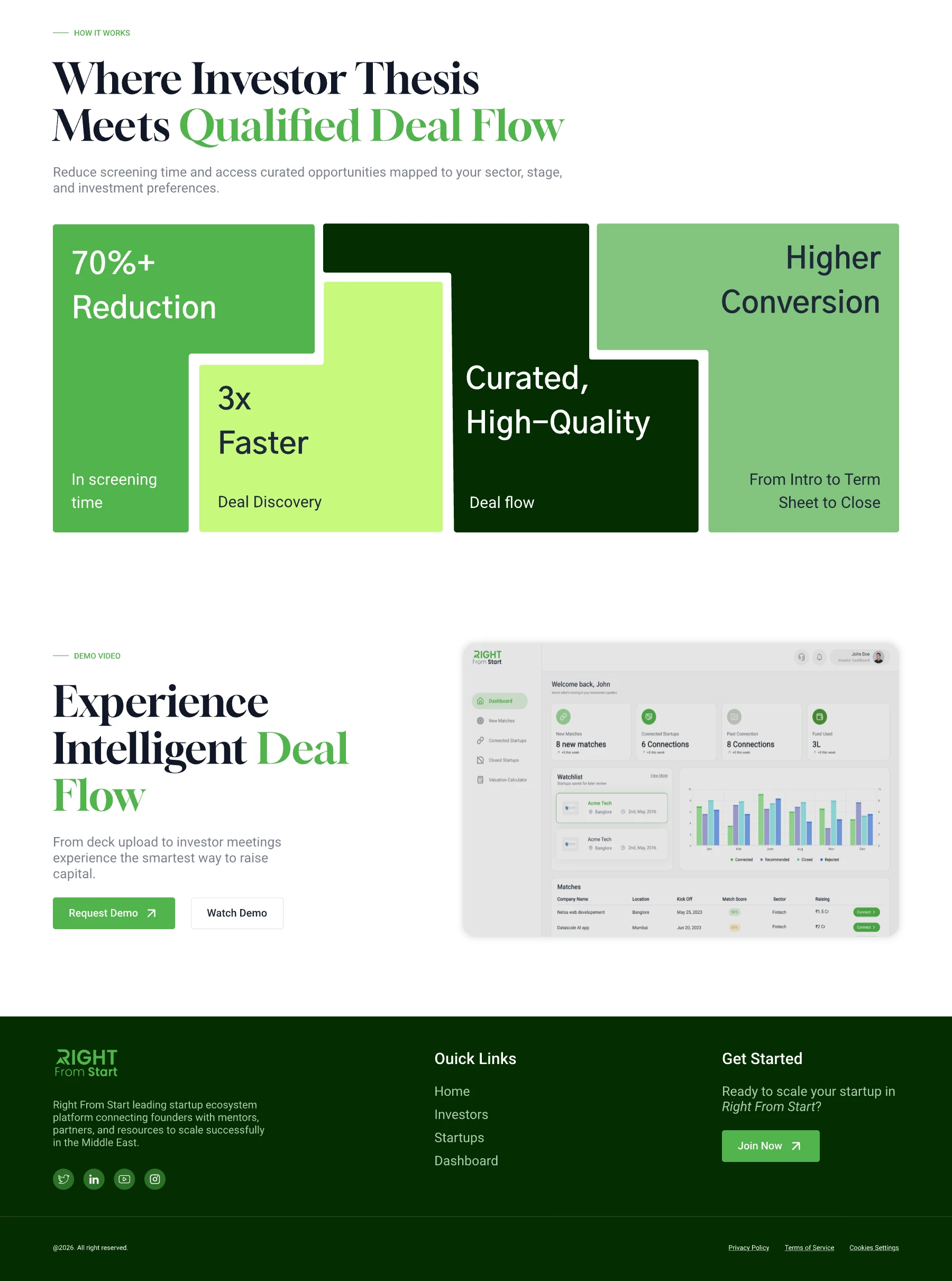
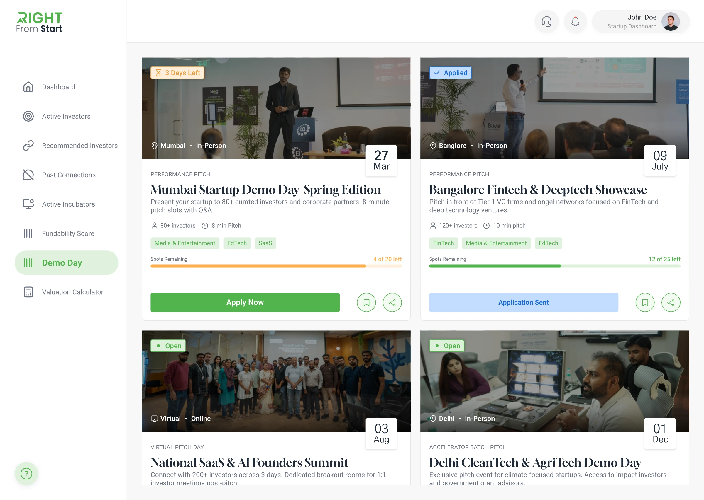
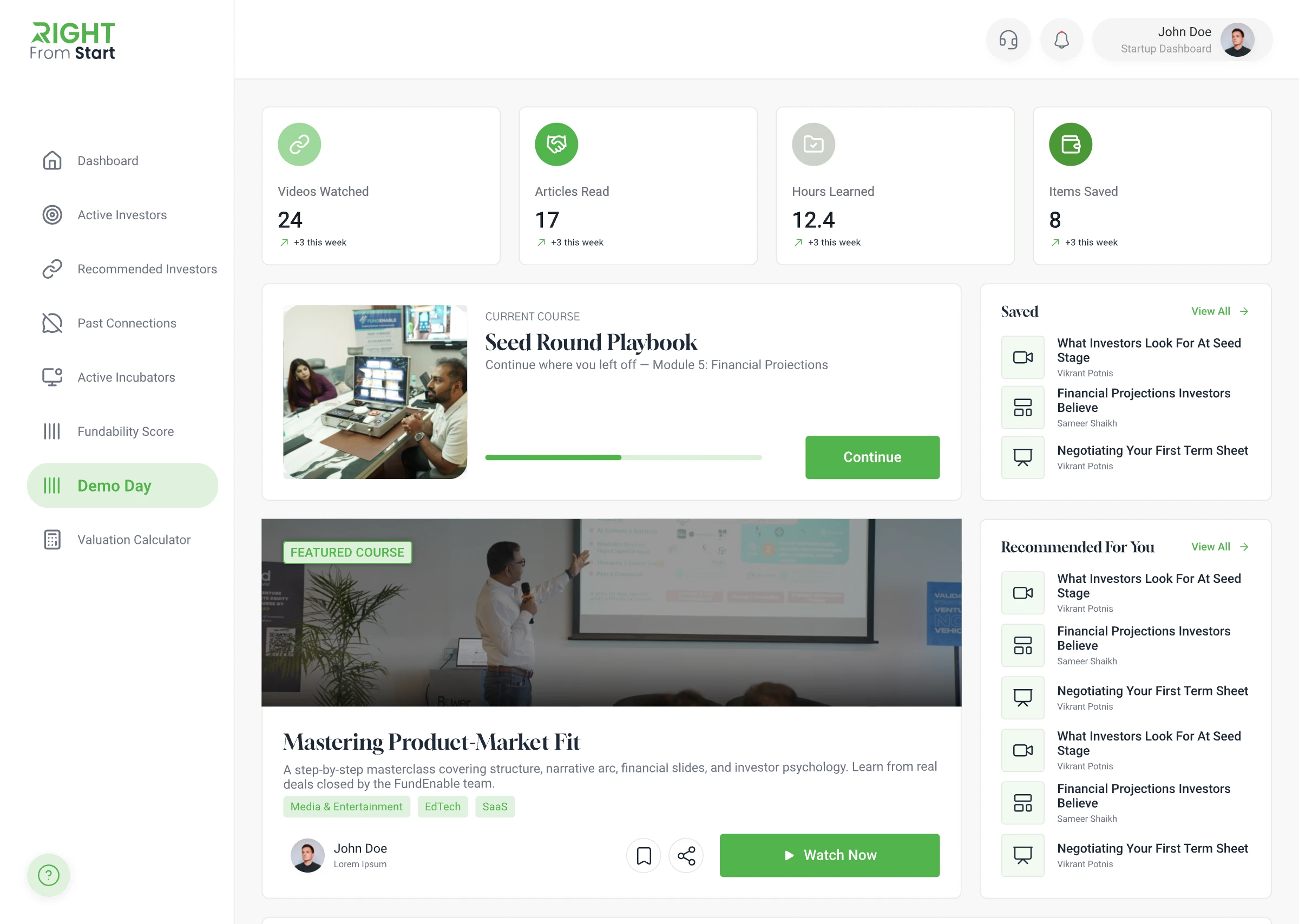
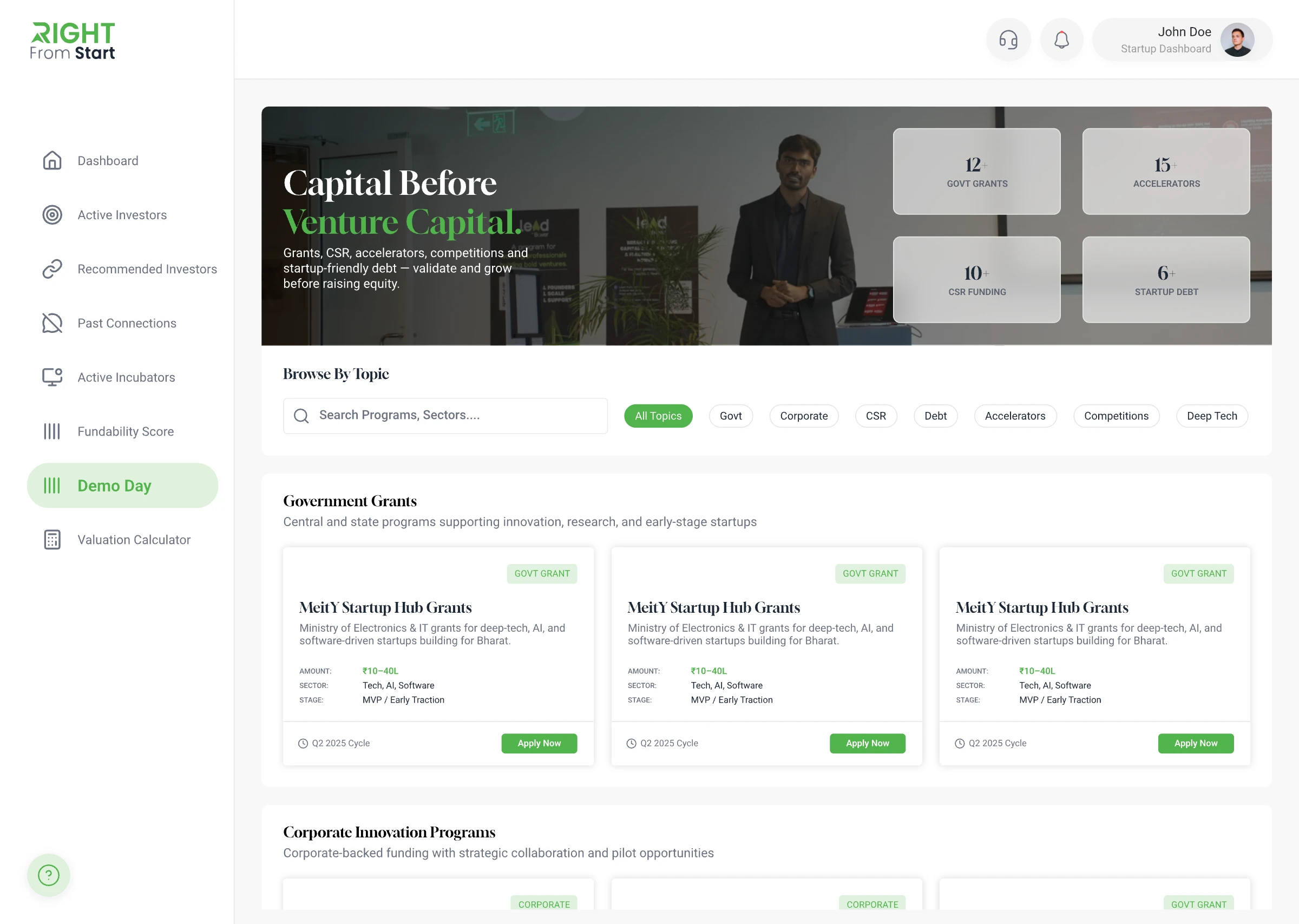
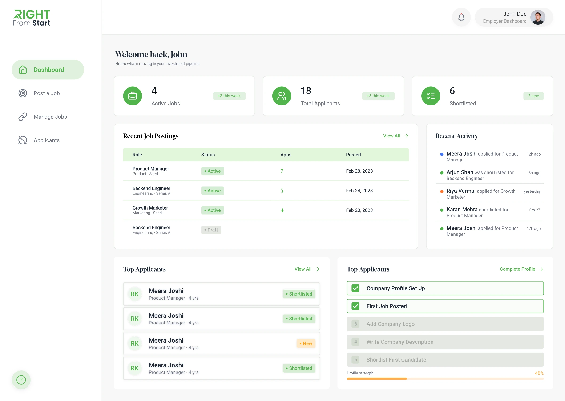
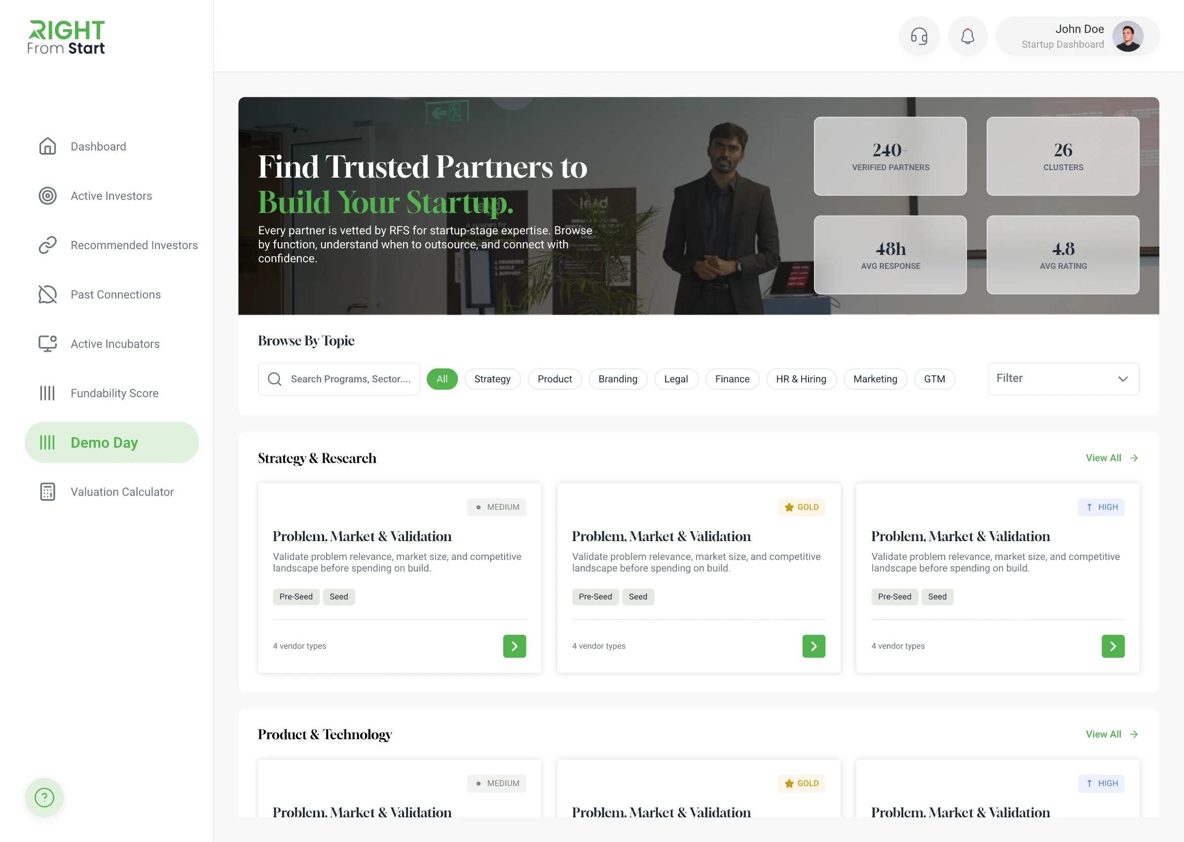
Right From Start came to us with a basic existing product and a much bigger vision: a full startup ecosystem covering a public-facing website and several internal dashboards for founders, investors, and partners. The entire product was designed from scratch.
Right From Start needed to support founders, investors, and incubators across a public website and multiple dashboards. The challenge was creating one visual direction and UI system that gave each audience what they needed without making the platform feel like disconnected products. I contributed to defining the shared visual language, UI patterns, and motion direction that connected those experiences.
To address this, we established a shared visual system across the website and dashboards, using consistent typography, colour, components, and motion patterns. I contributed to the UX/UI design and motion direction, then communicated the interaction details to the development team during handoff.
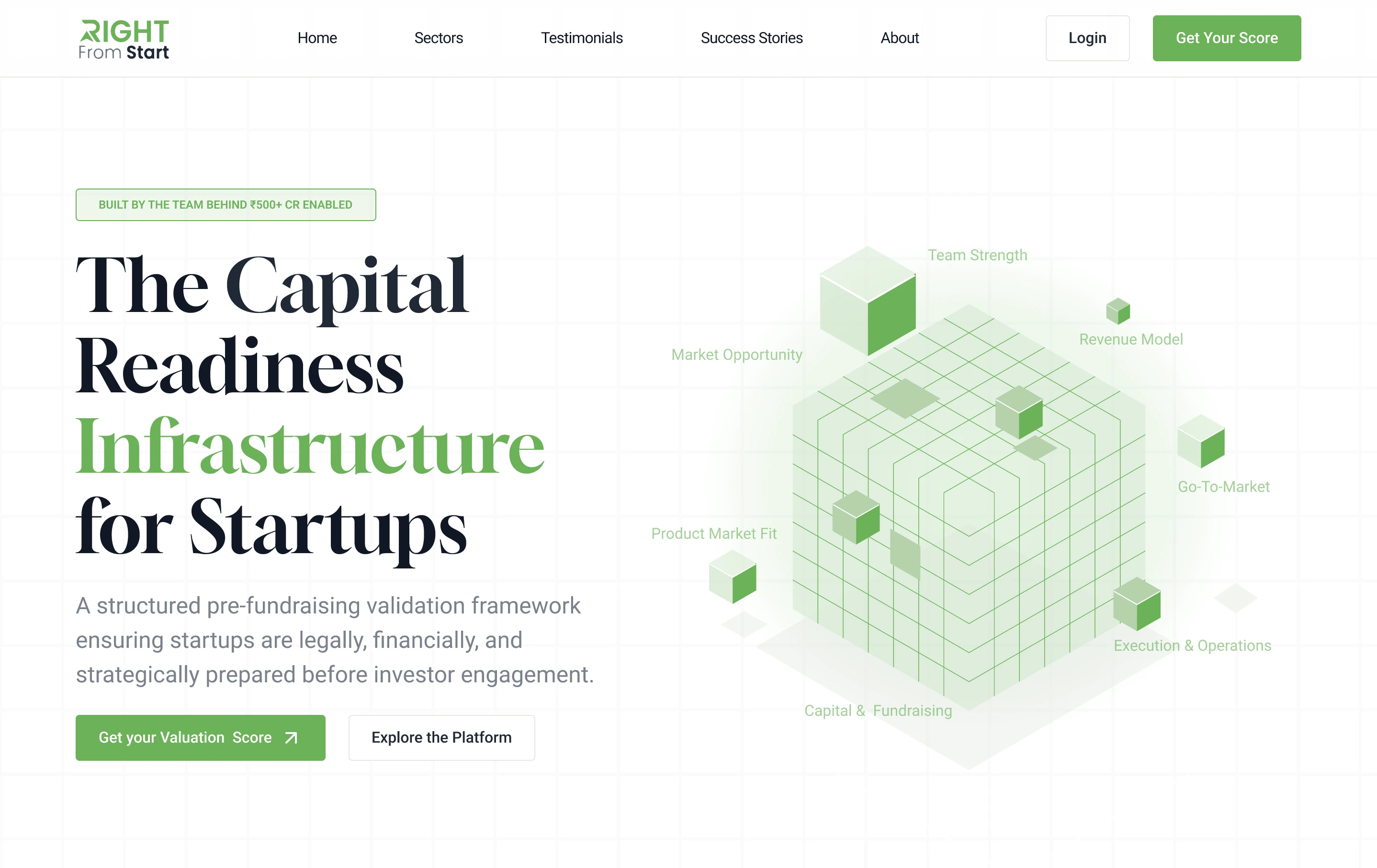
Right From Start brings together the public website and connected experiences for founders, investors, and incubators. Rather than treating each area as a separate product, we designed them around one shared visual system. My work focused on applying that direction across screen layouts, UI patterns, and motion details so the platform remained consistent across every touchpoint.
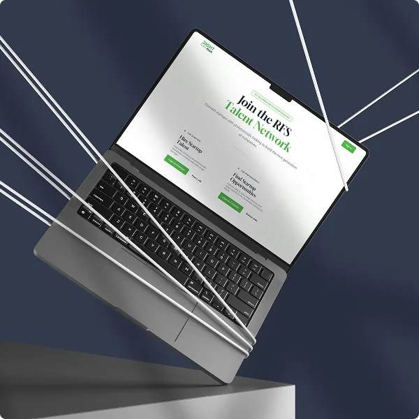

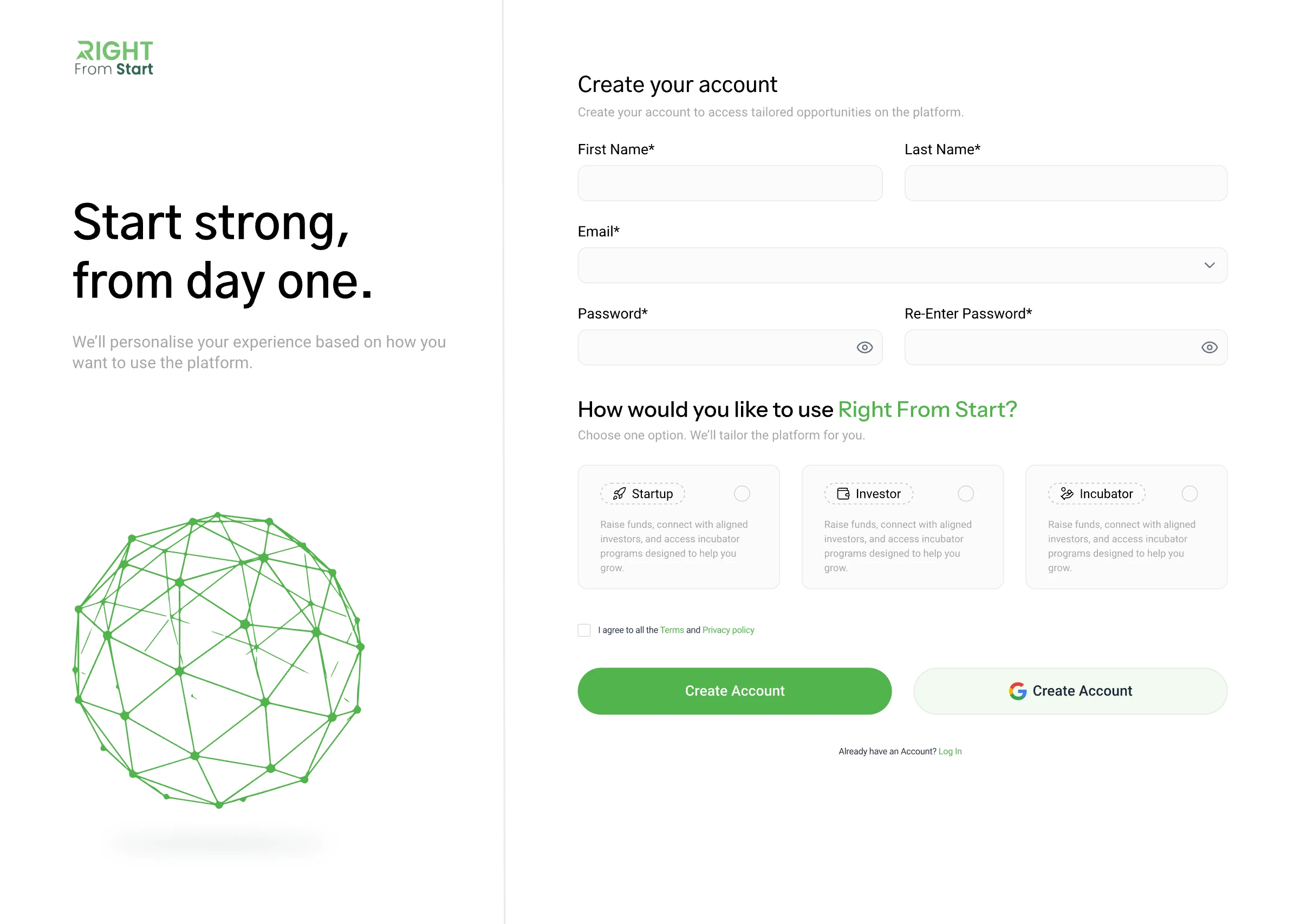
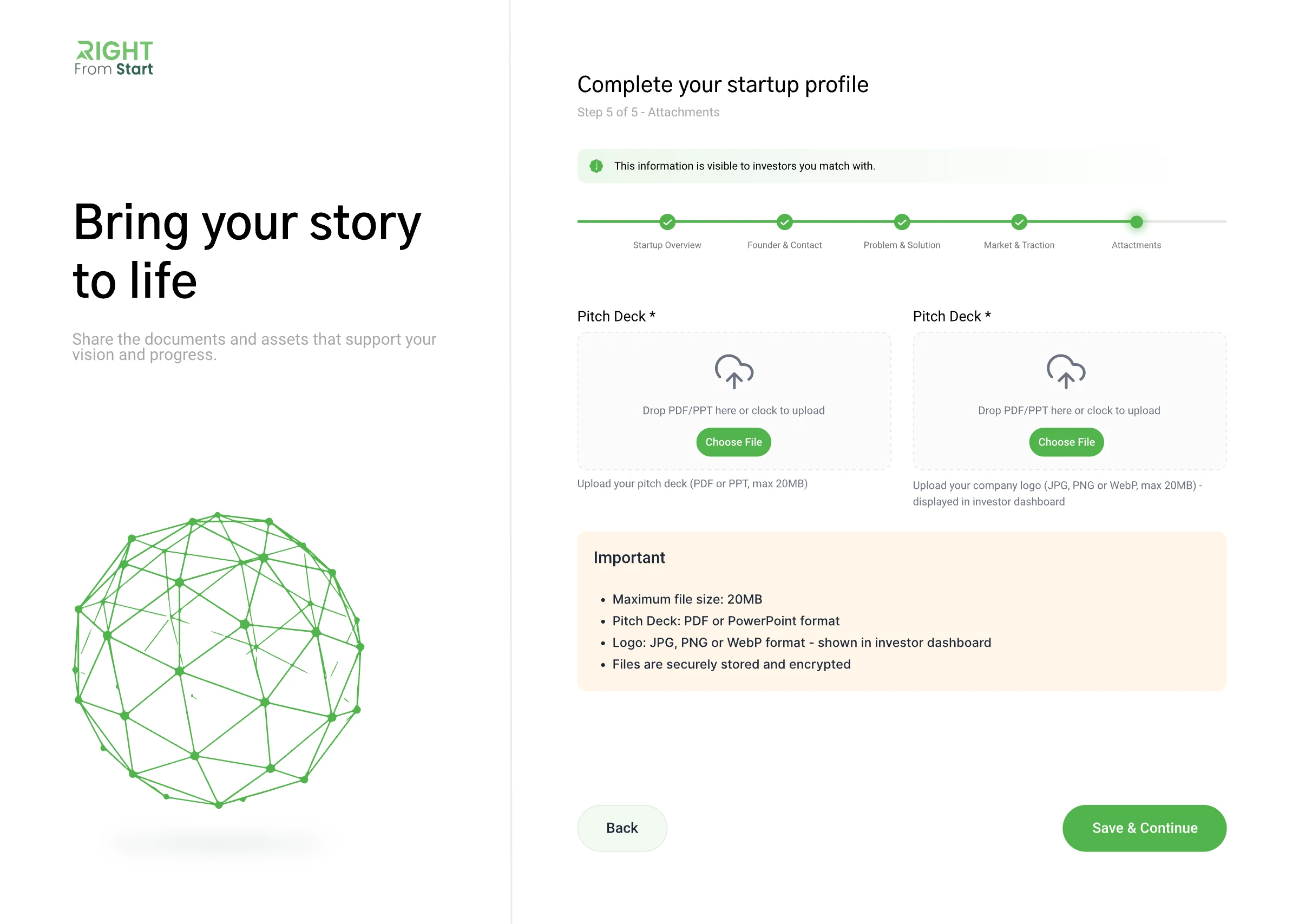
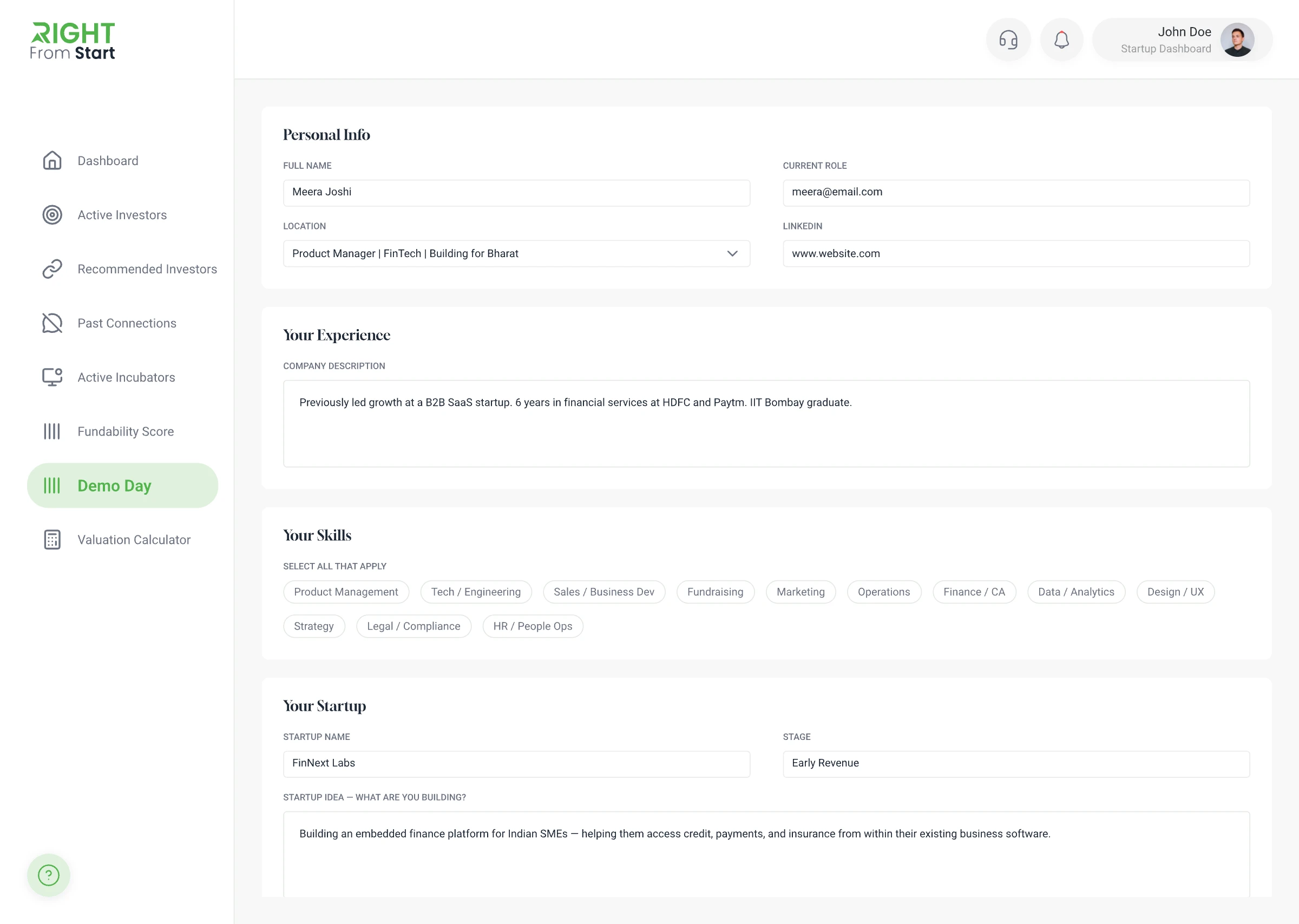
Creating an investor-ready profile requires founders to share a lot of information: their team, business, progress, and story. Instead of presenting every field in one long form, we grouped questions into clear topics and showed progress across the journey. This made a high-effort task feel more manageable and helped founders understand what each step was asking for.
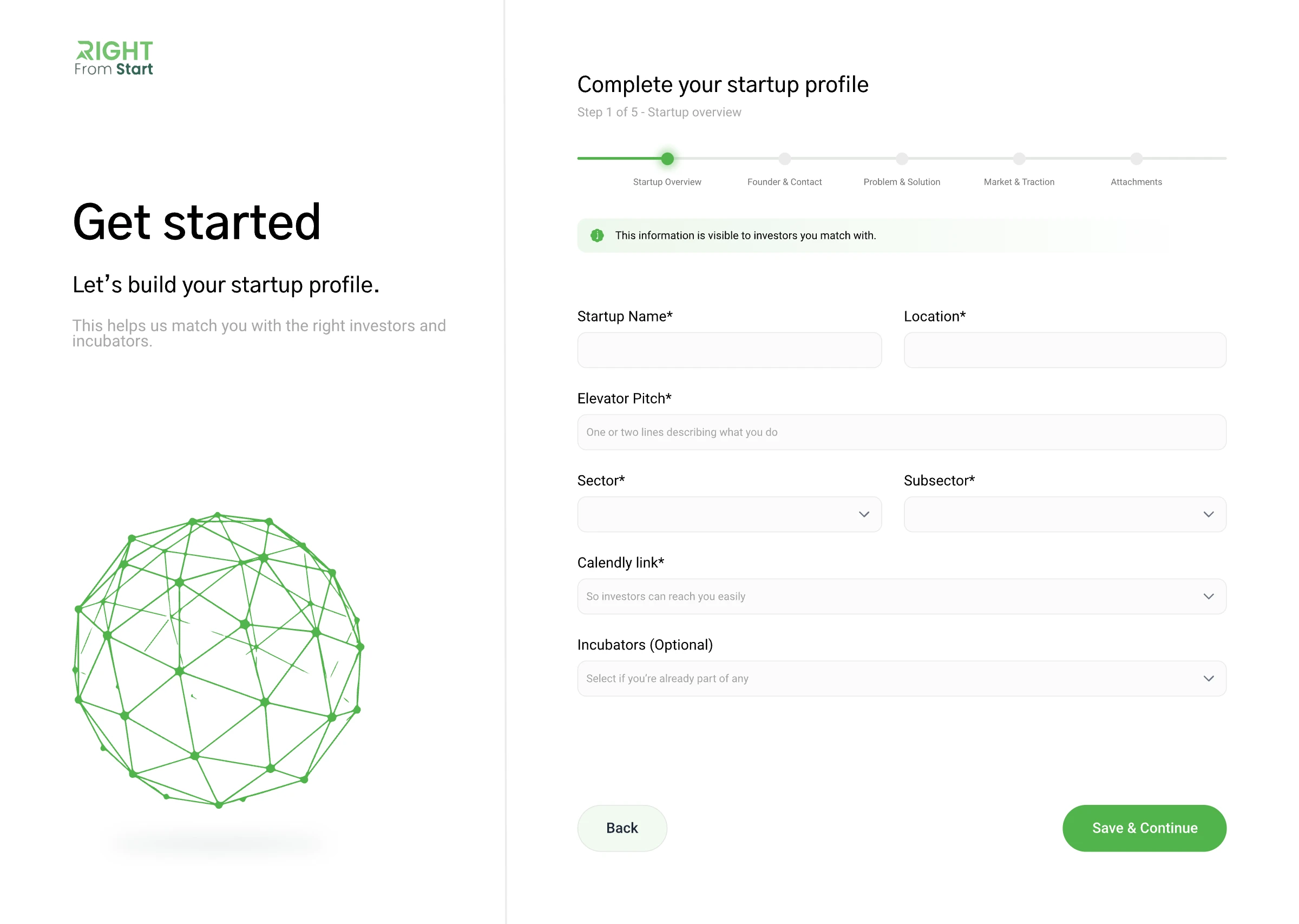
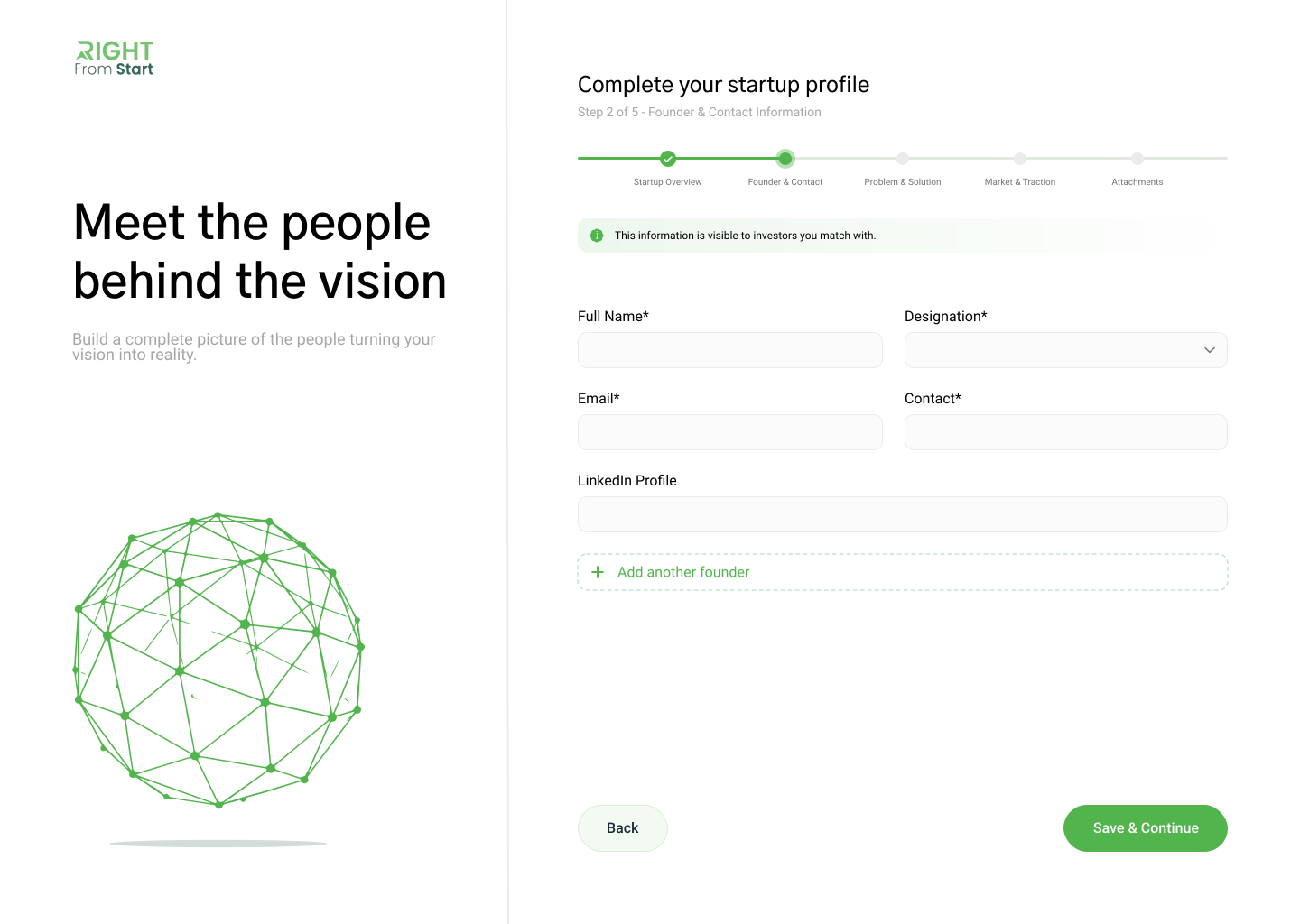
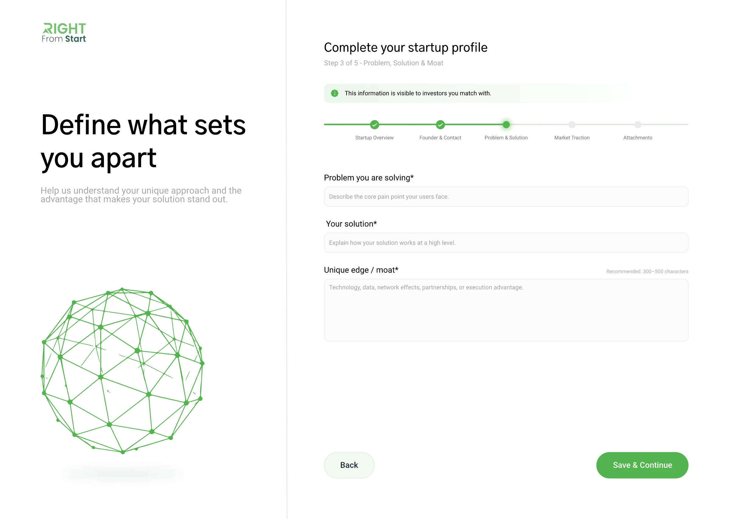
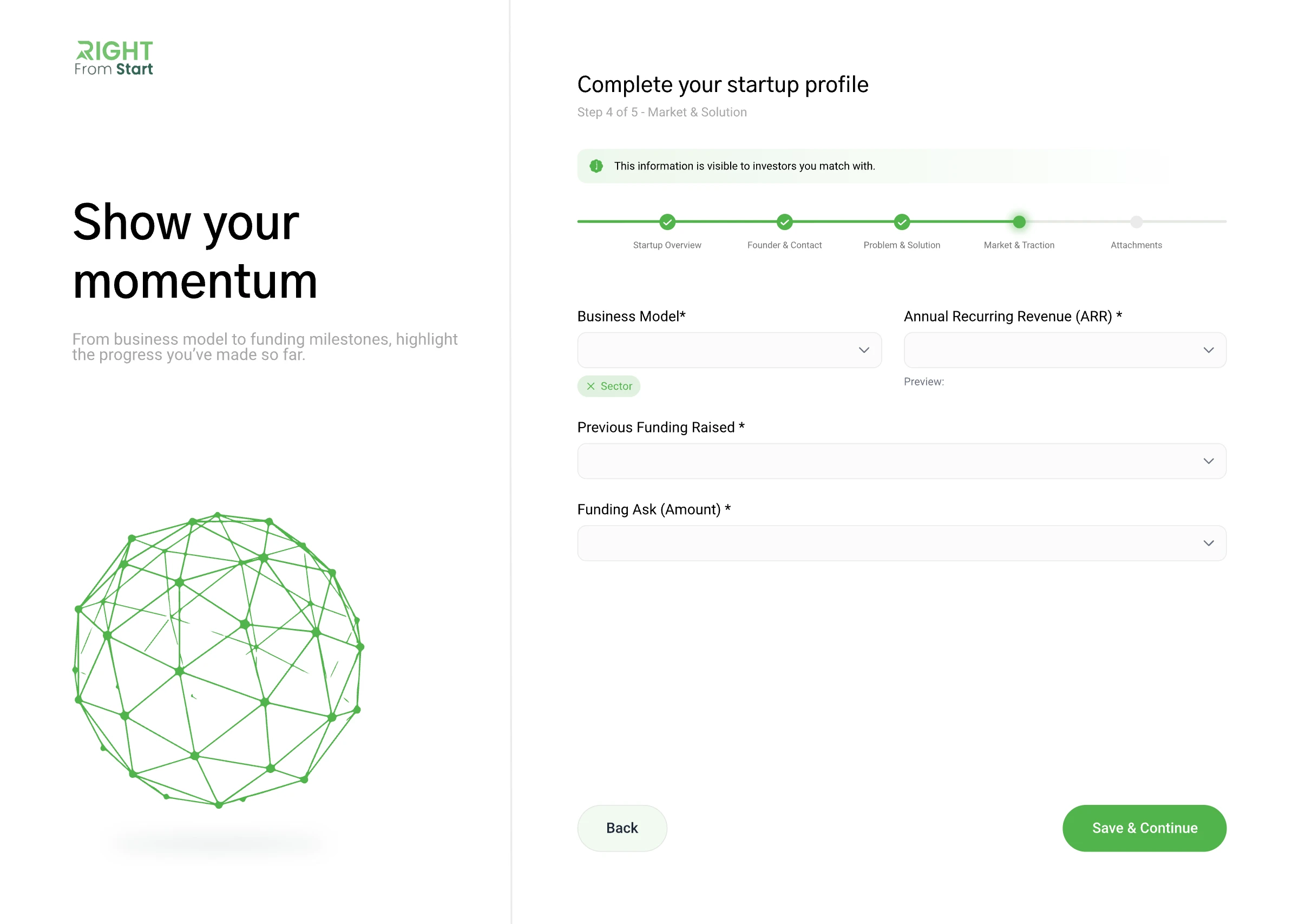
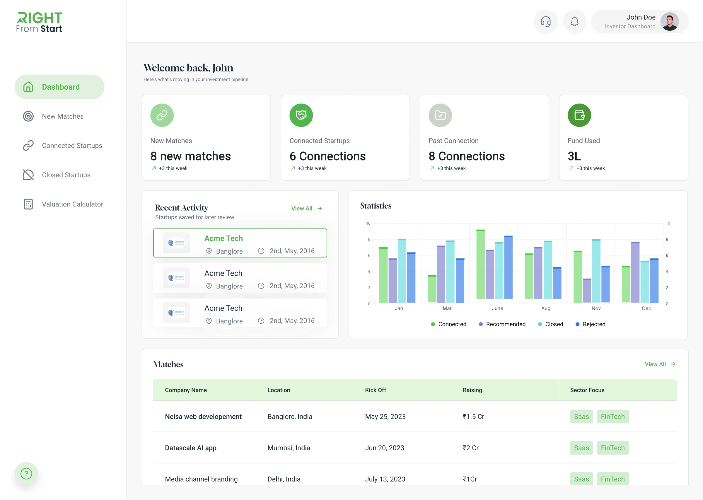
Collaborating with the founders and design team to shape the public website and connected dashboards, helping ensure each experience supported one shared platform direction.
Designing UX flows and screen structures across founder, investor, and incubator experiences, with attention to clear navigation and consistency across the platform.
Applying the shared visual direction across the website and dashboards through consistent components, typography, colour, and layout patterns, so the platform feels connected across audiences.
Defining motion direction for key interactions and communicating the intended details to the development team during handoff.
A connected ecosystem designed to support founders from idea to investment readiness.
 Founder
 Fundability
 Investor
 Startup
 Demo
Demo Knowledge
 Early Capital
 Smart
Smart Partner
 Ecosystem
 Hiring
 Valuation
 Investor
 Co-Founder
 Incubator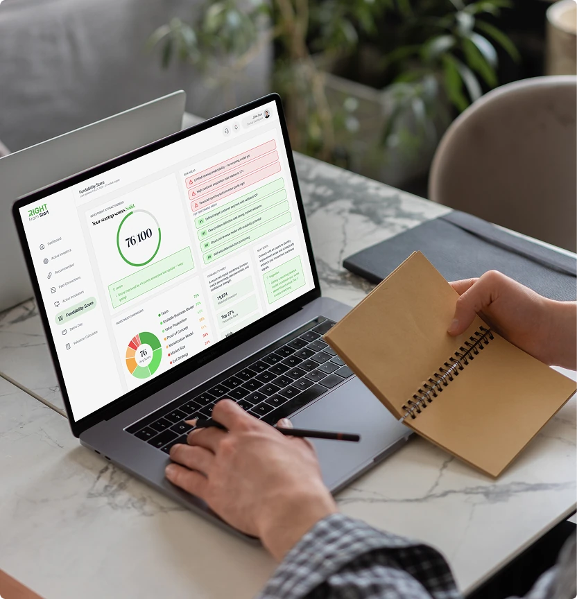
An overall score tells founders where they stand. The category breakdown tells them what to do next. By showing each investment dimension separately, founders can see which strengths to build on and which areas need attention before approaching investors.
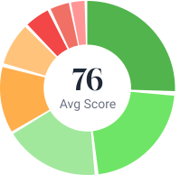
Bringing funding, learning, hiring, partnerships, and growth opportunities into one connected platform.
The most valuable lesson wasn't learning how to design better screens it was learning how to design the relationships between them. Every decision influenced another part of the ecosystem, reinforcing the idea that the strongest products aren't built feature by feature, but through connected experiences that work together seamlessly.